🔌 InForm Grasshopper Plugin
Overview
This section documents the InForm Grasshopper plugin API: the set of components used to build InForm-enabled definitions and send them to the InForm Web Platform.
The goal of this documentation is to provide a consistent, technical reference for each component, including:
- Purpose and typical use cases
- Location in the Grasshopper ribbon (tab/category)
- Inputs and outputs (types, abbreviations, behaviours)
- Notes, constraints, and best practices
- Example usage (where available)
Each component is documented on its own page using a standard structure to make lookup fast and predictable.
How the Plugin Is Organised
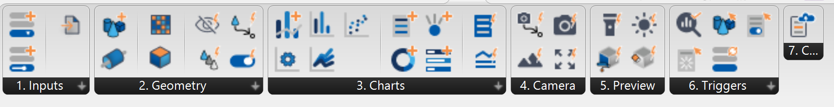
The InForm plugin components are grouped into 7 main areas.
Each area maps to a specific responsibility in the workflow.
1) 🧩 Input Components
Used to define design parameters that will appear on the InForm Web Platform and drive the generation of variants.
2) 🧊 Geometry Components
Used to convert Grasshopper/Rhinoceros geometry into InForm-ready objects and manage how geometry is organised and presented on the platform.
3) 📊 Chart Components
Used to publish metrics, KPIs, and visual outputs to the platform, enabling users to inspect results and compare variants.
4) 📷 Camera Components
Used to control how geometry is framed and viewed on the InForm Web Platform.
5) 🎨 Preview Components
Used to control visual appearance and rendering settings of geometry on the platform.
6) ⚡ Trigger Components
Used to define interactive actions that can be executed on the platform.
7) 🔗 Connect Components
Used to connect Grasshopper to the InForm Web Platform and control data exchange.
Recommended Reading Path
For first-time users, the recommended order is:
- Input components (to define parameters and drive variants)
- Geometry components (to visualise the model effectively)
- Chart components (to expose KPIs and enable comparison)
- Connect components (to understand how models are uploaded)
Component Documentation Format
Each component page follows a consistent template:
- Component name + abbreviation
- Screenshot
- Location (tab/category)
- Description (what it does and when to use it)
- Inputs (abbrev., full name, type, behaviour)
- Outputs (abbrev., full name, type, suggested connections)
- Example file (if available)
This format is intended to make it easy to:
- Understand component behaviour quickly
- Avoid common wiring mistakes
- Identify the correct downstream connections