3. Mean Bars
The Mean Bars chart compares the mean and standard deviation of a selected output across the values of a categorical input.
Use this when you want to understand how average performance differs between discrete design options — for example, comparing different structural systems, facade types, or material choices.
Click Add mean bars to add one to the page, then open Graph settings via the Settings gear icon to configure it.
The settings panel has two tabs: Data and Chart.
Data Tab
The Data tab is where you define what is plotted on the chart.
Adding a Dataset
Each dataset represents a set of bars defined by an X and Y axis. To add one:
- Click + Add dataset at the bottom of the Data tab.
- Give the dataset a name (this appears in the chart legend).
- Select a categorical input for the X axis — this determines what each bar represents.
- Select an output for the Y axis — this is the value being averaged across each category.
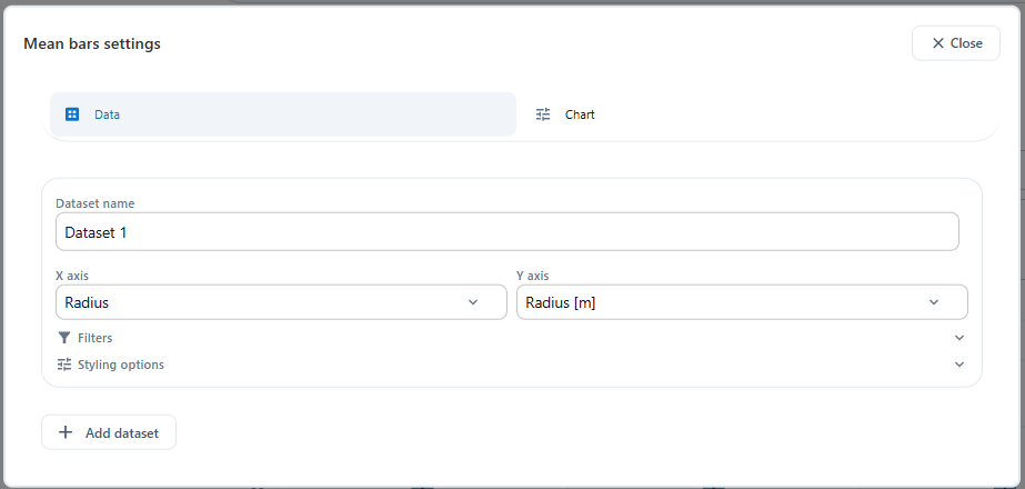
You can also expand Filters to restrict which variants are included in the dataset, and Styling options to adjust the bar colour and appearance.
You can add multiple datasets to overlay different filtered subsets on the same chart.
Chart Tab
The Chart tab contains options for controlling the visual layout of the mean bars chart.
X-Axis Tick Labels
By default, the X-axis labels are pre-populated from the parameter's dropdown values. You can edit these freely to replace raw values with more descriptive labels.
Each line follows the format value=label — for example:
0.1=100mm
0.2=200mm
0.3=300mm
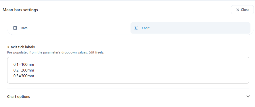
This is useful when your categorical parameter stores numeric codes internally but you want the chart to display meaningful names instead.
Reading the Chart
Once configured, the chart displays one bar per category. The height of each bar shows the mean value of the selected output for that category. The vertical lines extending above and below the bar are error bars representing the standard deviation — they show how much the output varies within that category.
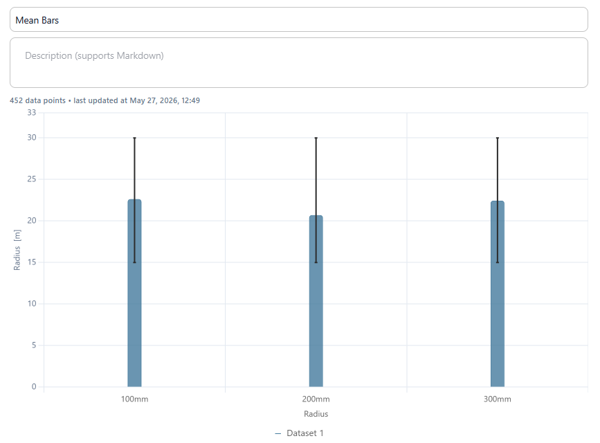
Narrow error bars mean the category produces consistent results regardless of other input values. Wide error bars mean performance varies significantly within that category, suggesting other inputs are also influencing the output.
Hovering Over a Bar
Hover over any bar to see a tooltip showing:
- The dataset name
- The mean of the output for that category
- The minimum of the error bar (mean minus one standard deviation)
- The maximum of the error bar (mean plus one standard deviation)

What to Look For
- A category with a higher mean performs better on average for that output.
- Small error bars (low standard deviation) mean that category performs consistently regardless of other input values.
- Large error bars mean performance varies a lot within that category — other inputs are also playing a significant role.
- If all categories have similar means, this input may not be a meaningful differentiator for that output.
Tips
- Bar plots work best for inputs with a small number of distinct values (e.g. 2–6 options).
- Combine with the sensitivity graph to confirm whether the categorical input is actually a significant driver.
- Look for categories with both a high mean and low standard deviation — these are the most reliably strong performers.
- Use the X-axis tick labels to replace internal parameter codes with readable names before sharing the Trends page with a client.
Next: 4. Sensitivity Graph