2. Scatter Chart
The Scatter Chart plots individual variants as points on a two-axis chart. It is the most versatile chart type in Trends and can be used for Regression and Pareto analyses.
Click Add scatter chart to add one to the page, then open Graph settings via the Settings gear icon to configure it.
The settings panel has three tabs: Data, Analyses, and Chart.

Data Tab
The Data tab is where you define what is plotted on the chart.
Adding a Dataset
Each dataset represents a set of points defined by an X and Y axis. To add one:
- Click + Add dataset at the bottom of the Data tab.
- Give the dataset a name (this appears in the chart legend).
- Select a variable for the X axis and one for the Y axis using the dropdowns.
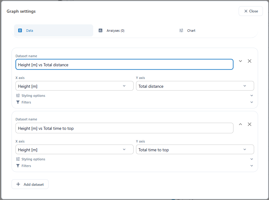
You can add multiple datasets to a single chart; for example to overlay different filtered subsets.
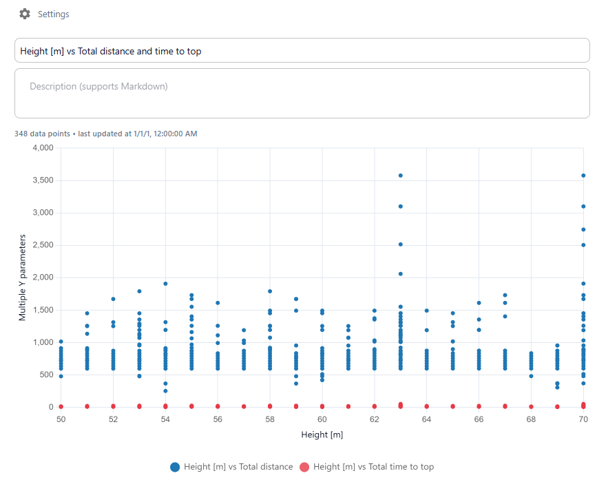
Styling Options
Expand Styling options to control how the points are displayed:
- Color — the colour of the data points
- Point size — the radius of each dot
- Stroke — the border thickness around each dot
- Opacity — the transparency of the points (0 = invisible, 1 = fully opaque)

Filters
Expand Filters to restrict which variants are included in this dataset. Only variants matching all active filters will be shown in the chart and used in any analyses.
To add a filter:
- Click + Add filter.
- Select the variable to filter on.
- Choose a condition:
- Equals — only include variants where the variable matches a specific value
- Doesn't equal — exclude a specific value
- Greater than — only include values above a threshold
- Less than — only include values below a threshold
- Enter or select the comparison value.
Multiple filters can be stacked on a single dataset. This is useful for isolating a specific subset — for example, only variants with a specific structural system and a height above a certain value.

Analyses Tab
The Analyses tab is where you overlay statistical analyses on top of the scatter plot.
You can add Regression or Pareto Front analyses. These are drawn on top of the data points and update automatically as the data changes.
To add an analysis:
- Select the type from the New analysis dropdown — either Regression or Pareto Front.
- Click + Add analysis.
You can add multiple analyses to one chart.

Each analysis type is covered in detail on its own page:
- 2.1 Regression — trend lines showing how one variable responds to another
- 2.2 Pareto Front — the boundary of optimal trade-offs between two outputs
Chart Tab
The Chart tab contains advanced options for controlling the visual layout of the scatter chart.
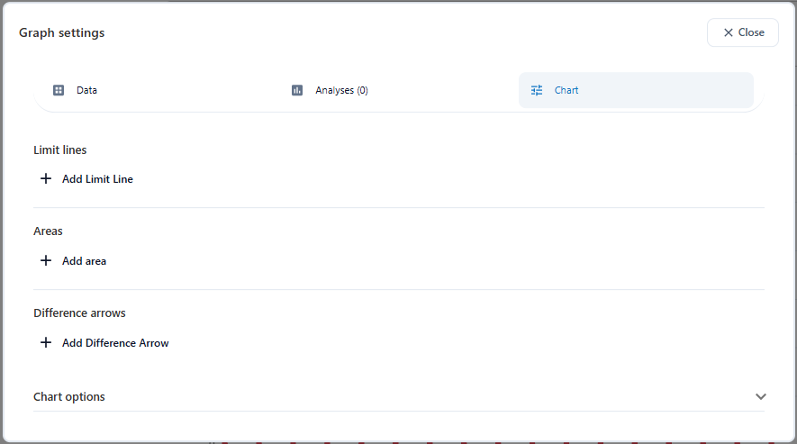
Limit Lines
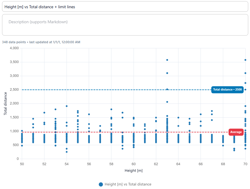
Add horizontal or vertical reference lines to the chart to mark thresholds or reference values. Each limit line has a name, a direction (horizontal or vertical), and a value source — either Manual value or Automatic.
Manual value — you enter the X or Y position of the line yourself. Use this when you have a fixed threshold in mind, such as a maximum allowed distance or a target value.
Automatic — the line position is calculated from a dataset. Choose between:
- Average — the mean of all Y (or X) values in the selected dataset
- Maximum — the highest value in the dataset
- Minimum — the lowest value in the dataset
Select which dataset to use under Use datasets.
For both types you can also set:
- Thickness and Opacity — control the visual weight of the line
- Show value — toggle a label showing the line's value on the chart
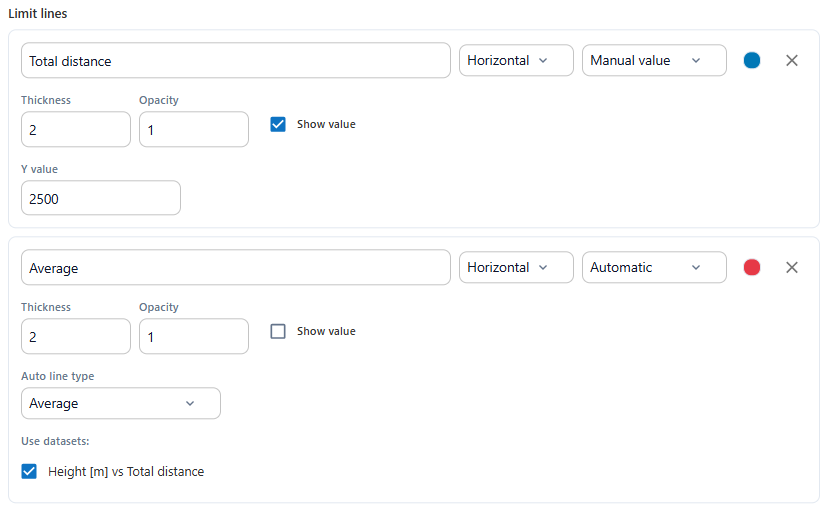
The example below shows two limit lines on the same chart: a manual horizontal line at 2500 and an automatic average line calculated from the chosen dataset.
Areas
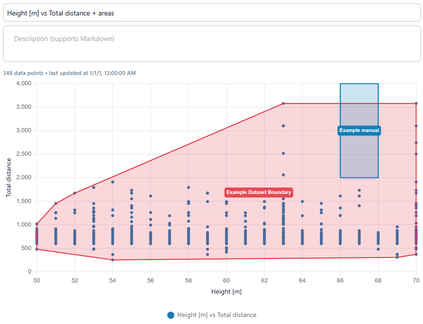
Add shaded regions to the chart to draw attention to specific zones — for example, a performance target range, a zone to avoid, or the spread of a particular design cluster. There are two area modes:
Manual points — you define the shape yourself by entering a series of polygon points (x, y). Use this when you have a specific region in mind that is not directly tied to the data, such as a rectangular target zone or a constraint boundary.
Dataset boundary — the area is computed automatically from a dataset. It draws a filled shape around all the points in the dataset, showing the full extent of where the data lies. Use this to visualise how much of the design space a dataset covers, or to compare the spread of two filtered subsets side by side.
For both modes you can set:
- Name and color — displayed as a label on the chart if Show label is enabled
- Opacity and Border width — control the fill and outline weight
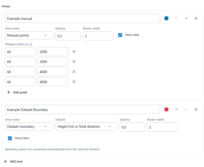
The example below shows both modes on the same chart: a manually defined rectangle and an automatically computed dataset boundary.
Difference Arrows
Difference arrows draw annotated arrows between two reference lines on the chart, showing the gap between them at a specific position. This is useful for communicating how far a design is from a target, or how much two limit lines differ at a given point.
Each difference arrow has:
- Name — a label shown on the arrow annotation
- Reference type — choose Limit lines or Analyses as the source of the two lines to compare
- Direction — Vertical (fixed X) draws a vertical arrow at a specific X position; Horizontal (fixed Y) draws a horizontal arrow at a specific Y position
- Difference type — either Absolute difference (the raw numeric gap) or Percentage difference (the gap relative to the lower line)
- Color — the color of the arrow and its label
- From line / To line — select which two limit lines or analyses to measure between
- X position (or Y position) — the point along the axis where the arrow is drawn
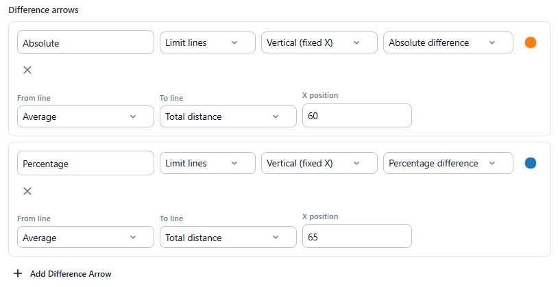
The example below shows two difference arrows at different X positions: one showing the absolute gap and one showing the percentage difference between the average line and a manual limit line.
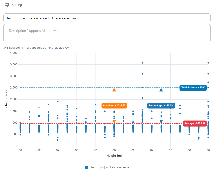
Chart Options
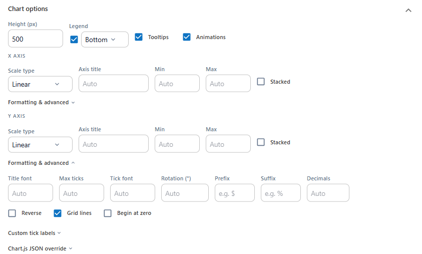
The Chart options section controls the overall visual layout of the chart.
Height (px) sets the rendered height of the chart block on the page.
Legend, Tooltips, and Animations can each be toggled on or off.
Axes
For both the X axis and Y axis you can set:
- Scale type — Linear, Category, Logarithmic, or Time
- Axis title — overrides the auto-generated label
- Min and Max — fix the axis range; leave as Auto to let the chart scale to the data
- Stacked — stack multiple datasets on top of each other
Formatting & Advanced
Expand Formatting & advanced under either axis for additional controls:
- Title font, Max ticks, Tick font, Rotation — fine-tune how axis labels are displayed
- Prefix and Suffix — add units or symbols to tick labels (e.g.
$or%) - Decimals — fix the number of decimal places shown on tick labels
- Reverse — flip the axis direction
- Grid lines — show or hide the background grid
- Begin at zero — force the axis to start at 0
Expand Custom tick labels to manually define the labels shown at specific tick positions along an axis.
Chart.js JSON Override
For full control, expand Chart.js JSON override to paste a raw Chart.js configuration object. Any properties defined here will overwrite the chart's generated settings. This is an advanced option intended for cases where the standard controls don't offer the level of customisation you need.
With all these options — limit lines, areas, difference arrows, axis scaling, and formatting — you can tailor the scatter chart to communicate exactly what you want to show. Next up: 2.1 Regression, which covers how to add a trend line to your chart.